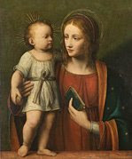
My web guy, Kaleb of Mad Hatter Design, has been working like crazy redesigning my Catholic homeschool website. He had all the work just about done and then the cover art for the new book came in. He fell in love with it and, as a result, he completely redid the whole design.
Do you like it? Leave a comment for me and let me know what you think.
To see the whole test website, click here: Maureen Wittmann Test. But don't bookmark it yet, the final URL will be Catholic Homeschooling. And keep in mind that there is still some mopping up to do. Plus Kaleb is going to add a crucifix or rosary to the final design.
If you are ever in need of design work (logo, business card, or website) you should ask Kaleb for a proposal. Not only is he talented, but great to work with.


 Stumble It!
8 comments:
Absolutely like it. Great webguy :)
Denise in Ohio
You already know I LOVE it!
I love the look, the color, and the eraser. I don't know why, but I really like erasers. They are kind of like confession for me....maybe I'm strange.
It's always nice to know that we can erase our mistakes ;-).
I love the redesign! Kaleb is very talented.
I think it's great! And what fun to see your family picture. :-)
Whoa, that looks *very* kewl (cool)! Kaleb did an awesome job!
Cat
What a great design! I really liked it. User friendly and attractive. I especially liked the post-it notes.
Your family is lovely.
(blush) thank you very much ;-) I'm flattered by all your compliments
Post a Comment